Rebooting Reboot: The Reboot Brand and Logo Project
The Reboot organization has been a part of my life for a decade, delivering to me a unique touchpoint for Jewish life that has been different from other more traditional Jewish institutions. In that time, I’ve hosted the Reboot Shop Hanukkah Pop-Up in my office, delved into the reinvention of a wide variety of Jewish life cycle moments and celebrated the high holidays on the beach Reboot-style with bagpipers, jazz musicians and s’mores.
So when the Reboot leadership began to explore a new brand for the now 20-year-old organization to fit its new direction as a leading digital platform for the modern Jewish world, I felt I could help by bringing both my expertise and my knowledge of Reboot. It was a formidable task. We knew that if we came up with something great, it would strengthen Reboot and do what a brand and logo are meant to do – tell the story succinctly, powerfully and deftly. But given the strong feelings many have about Reboot and its place in Jewish life, there was pressure to get it right.
A “brand” is more than just a logo design or the way a company or product looks. Brand is defined by how a company behaves – how a company shows up in the world, how it engages with its constituents. In fact, a brand equals the sum total of all interactions a person has with your product, company or organization. So, my job is to make all of those interactions amazing, informative, entertaining, shareable, and ideally memorable. As we thought about seeing the logo in action, we created a list of experiences or ‘contexts’ to test-drive it, to see if it worked. Would the logo communicate, stand out or conversely just blend in and become invisible?
Using these contexts as a jumping off point, we chose to do a dry run with different iterations: the sticker on a vinyl record, a red carpet backdrop with the logo placed between HBO and A24 logos, an app icon on your phone, lock up system with the words PODCAST, STUDIO and EVENT, the bottom of a webpage menu placed next to a Hillel logo or a number of Jewish partner organizations and finally on a flat brim hat worn by Little Dickey. We also animated it to see how it could kick off a short or a feature film.
In the end, when the logo was free and out in the wild, we wanted there to be a degree of symbolism or narrative attached to why it looks the way it does. The logo is a storytelling vehicle. It is the common language we all feel confident using when describing or talking about this creatively powerful yet hard-to-define organization.
It had to demonstrate the promise of Reboot’s mission: “Reboot reimagines, reinvents and reinforces Jewish culture and traditions for wandering Jews and the world we live in.” It had to be bold and iconic. It has to be modern and cool and not necessarily too “Jew-ish.”
This of course begs the question, what is Reboot? A network (with layers of affiliation), a media company (content creators with distribution firepower), a catalyzing force, a community, a vehicle for transformation. Thinking of Reboot as an organism we also wanted to capture the interplay of the network with the ideas that it has created. We wanted to, in some way, meld the very essence of the Jewish tradition of questioning and seeking answers into our quest for a contemporary logo.
EVOLVING
We wanted the logo to communicate “forward”, “momentum” or “evolving” – suggesting learning from the past in determining the future. The “RE” is what makes Reboot unique. There may be other organizations like Reboot but what we do better than anyone is root everything we do today in something from the past. We apply historic learnings into our contemporary projects in the hope that people will use them and integrate them into their modern way of participating in Judaism.
RE-imagine, RE-flect, RE-frame, RE-tell, RE-fresh, RE-engage, RE-read, RE-mind, RE-turn, RE-consider, RE-juvenate, RE-sist, RE-build, RE-call, RE-consider etc.
REBOOT does not INVENT. REBOOT RE-INVENTS.
With the logo acting as the advance team for the brand, it had to be able to tell the story when there was no one around to help. Typeface, color, icon, shape are all the crucial elements to overthink.
While we looked at a number of options, we ended up pulling inspiration from moving type, in particular those great analog Arrival / Departure “ticker” boards found in train stations and airports around the globe. The idea is to have the identity act as the organization does: in perpetual motion, constantly evolving and redefining itself. It was inspired by the restless nature of Reboot’s mission. To challenge, to reinvent, to evolve what it means to be Jewish in the 21st century and beyond.
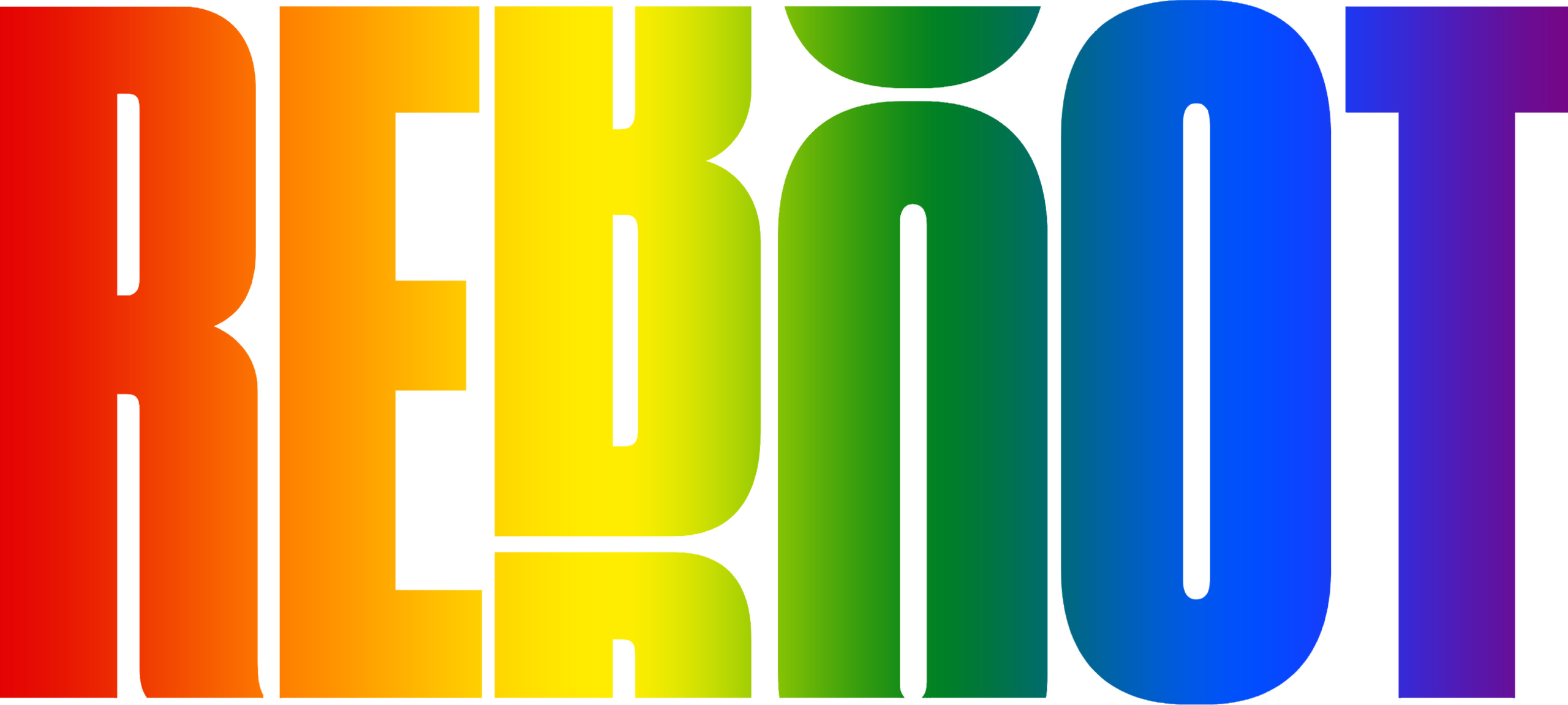
The “B” and “O” caught in slight rotation evoke the feeling of motion. We considered many variations of which letters were rotated and how much. This configuration was the bare minimum needed while still feeling solid and not dizzying as a whole. And it was important to keep the “RE: static to act as an icon when extracted from the logo.
The color palette was constructed to be energetic with plenty of contrast for dramatic color pairings.
We had a good time naming the color palette to make these colors our own, further pulling Yiddish into the mix with Reboot Chutzpah (red), Reboot Gelt (green) and Reboot Bubbeleh (pink) as examples. Our primary colors, Reboot Shmutz (off-white) and Reboot Drek (warm black), are intended to evoke a classic black-and-white vibe (for the editorial nature of the new site), but with some added warmth. The Yiddish brings a wink and a nod to our heritage and culture, even if a tiny fraction of people outside the Reboot organization will never see the brand guidelines— we know it’s there and it makes us smile.
This was such a gratifying project to be part of. For me personally I hope I have taken a step forward for all of us to understand what we’re part of and why it’s so meaningful and important. We look forward to seeing it come to life through the new website and all the initiatives the Reboot community will create. Huge thanks to David Katznelson, Tanya Schevitz, Todd Krieger, Josh Kanter, Cris Logan and the Code & Theory team for inviting us along for the ride.

